DISCORD
UX Research · Product Design
- Category
- UX/UI Design · Product Design
- Year
- 2026
- Role
- Solo UX Researcher & Designer
- Tools
- Figma, FigJam
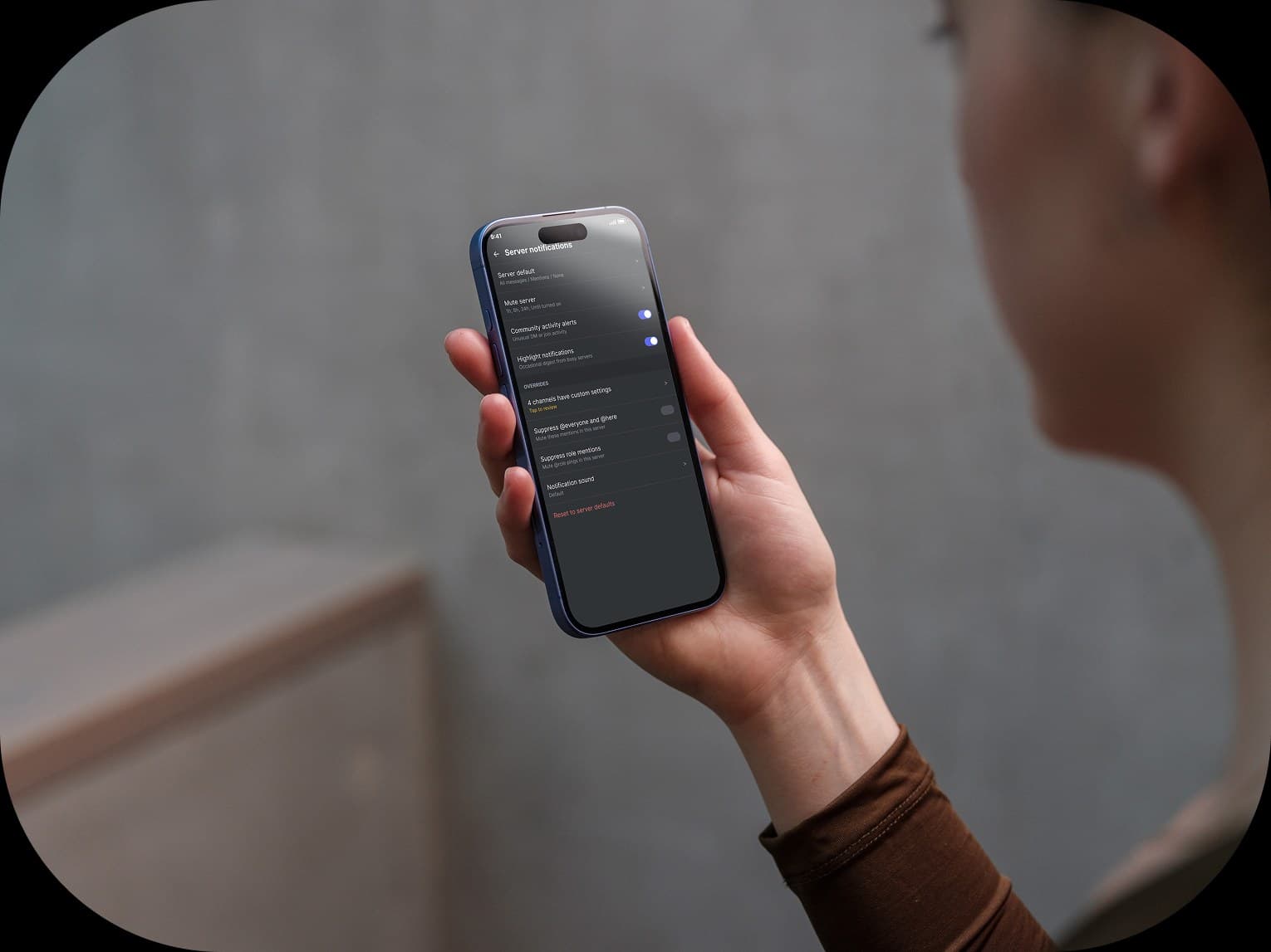
Scope
Notification settings navigation
Platform
Mobile (iOS)
Deliverables
Heuristic audit, IA, wireframes, mockups
Final solution
Notifications + Search
Representative final screens from both redesigns, shown in light and dark mode.
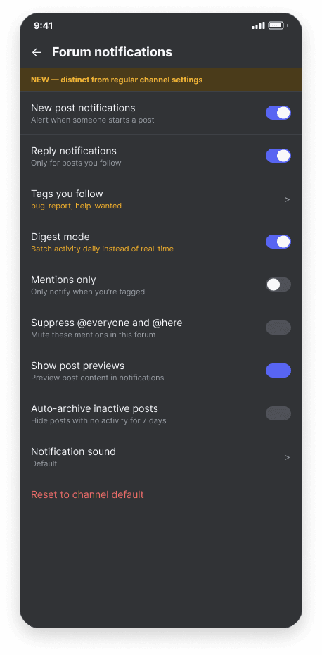
Notification settings — Forum controls

Search — Filter experience

The Problem
I ran a heuristic audit of Discord’s mobile app and kept hearing the same four complaints from new and experienced users alike. Two of them stood out as the most severe: easy to reproduce, high impact, and tied to a specific interaction rather than just a vague bad feeling.
Forum notification settings are fragmented and unclear. Users can't tell what they'll be notified about.
Mobile search broke after a recent update, with no feedback on why results are missing.
Features feel hidden: functions exist but require already knowing where to look.
Accessibility settings don't offer enough granular control.
I’m starting with the highest-severity one here: notification fragmentation, and specifically how it breaks down for forum channels, which behave nothing like a regular text channel but get none of the special treatment that difference calls for. A second section further down covers the search reliability problem.
What the Research Showed
To make the gap concrete, I compared Discord’s notification screens against Slack’s, side by side, pulling straight from real app screenshots instead of just going on assumption.
Discord Today
Notification controls are split across three separate menus: global settings, per-server defaults, and per-channel overrides, reached by long-pressing a channel and digging into a submenu. Forum channels inherit whatever the parent channel settings say, with no distinct treatment despite their threaded, tag-based structure.
Slack, for Comparison
Notification settings are centralized in one screen with clear radio choices (all messages, mentions, or nothing), plus a distinct control for thread notifications separate from general channel activity.
The Problem, Stated Precisely
Vague complaints don’t design well, so I turned “forum notifications suck” into something specific and evidenced, a statement I could actually design against.
Users can’t reliably control forum notifications because settings are split across global, server, and per-channel menus, with no forum-specific option, despite forums behaving nothing like a regular channel.
Designing the Fix
Instead of patching the existing three menus, I treated notification settings as one single drill-down hierarchy: Global, then Server, then Channel, with Forum branching off Channel as its own distinct step instead of a separate, hard-to-find fourth place. A long-press shortcut jumps straight into the right level, so I didn’t have to duplicate controls in a second system.

The actual FigJam flow used to plan the screens: global settings cascade down, branch to forum-specific controls when relevant, and a long-press shortcut skips straight to the right level.
What Forums Actually Need
Forums just generate a different shape of activity than a regular channel: parallel threads and tags instead of one linear conversation, so I wanted the controls to reflect that instead of inheriting generic channel settings.
New post notifications
A separate toggle for when someone starts a post, distinct from replies within a post you're already following.
Tag-based filtering
Subscribe to notifications for specific tags, like bug-report or help-wanted, rather than the entire forum.
Digest modeProposed, not existing
Batches forum activity into a daily summary instead of real-time pings for every reply. Discord doesn't actually offer this yet. It's my own proposal, backed by the fact that third-party bots already exist just to fill this gap, and people have been requesting it for years.
From Structure to Screen
I built this out in three passes, each one adding more fidelity without changing the underlying structure.
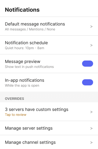
Low-Fidelity Wireframes
I started bare, with content and hierarchy only and no visual styling, so I could validate the information architecture before spending any time on polish.
Global
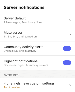
Server
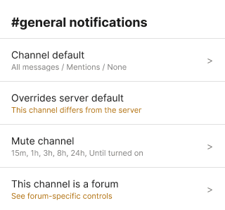
Channel
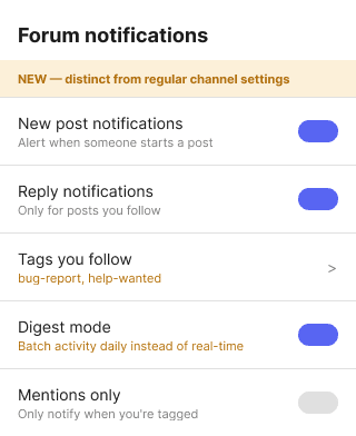
Forum
Refined Wireframes
Adding a device frame, a status bar, and a proper header made these feel like real mobile UI instead of boxes on a page. I kept it colorless on purpose, to stay focused on structure.
Light mode
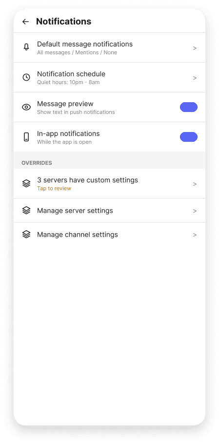
Global
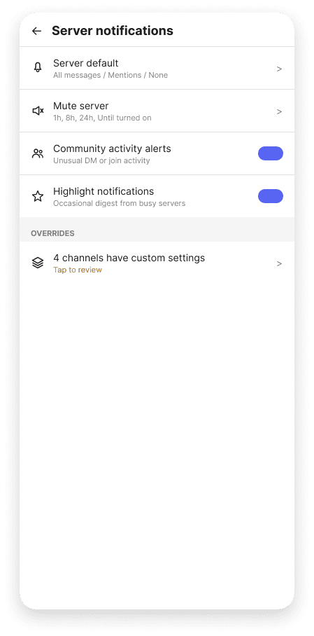
Server

Channel

Forum
Dark mode
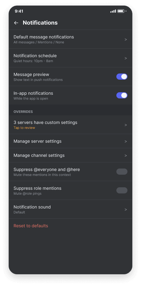
Global
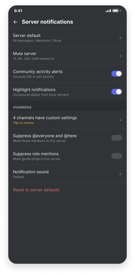
Server
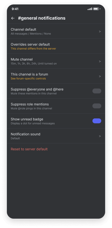
Channel

Forum
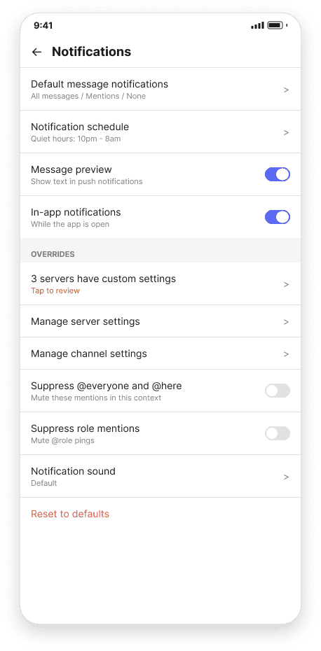
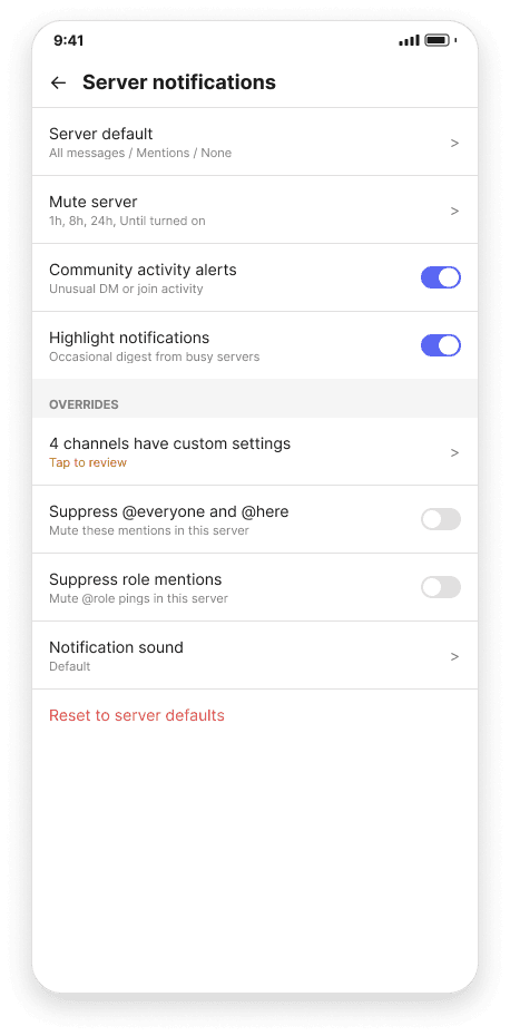
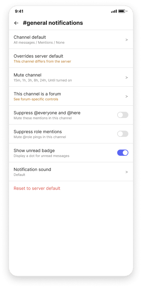
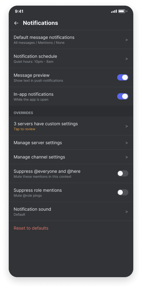
Final Mockups
Then came category icons, a bottom nav bar for context, and Discord's actual blurple accent, plus the amber highlight I carried over from the flow diagram, used to flag every row that's new or overridden.
Light mode
Global
Server
Channel

Forum
Dark mode
Global
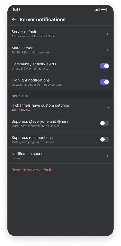
Server
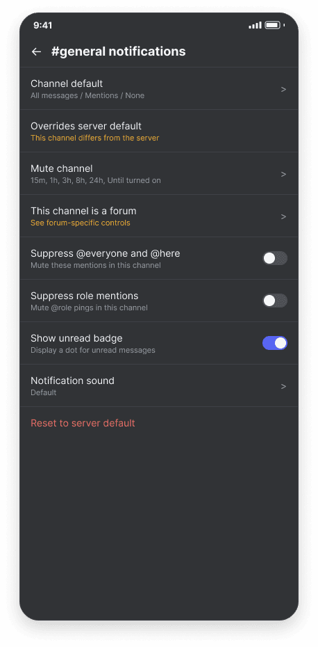
Channel
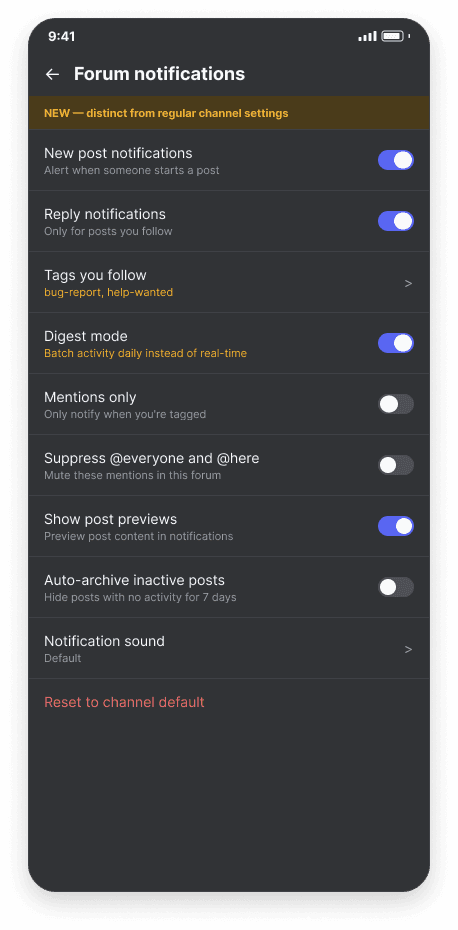
Forum
What This Actually Fixes
Mapping this back against my original heuristic audit, the redesign answers the specific violations I set out to fix, not just a general sense of clutter.
Visibility of system status: the overrides summary on the Global screen surfaces which servers or channels have custom settings, instead of leaving that invisible until you happen to check.
Recognition over recall: Forum sits as a visible branch off Channel rather than a setting users have to already know exists.
User control and freedom: per-tag and per-post subscription replaces an all-or-nothing forum toggle.
Next up: wiring these screens together in Figma into a clickable prototype, and usability testing the forum notification screen specifically, since digest mode is the idea I’m least sure about.
Second Problem
Search You Can't Trust
That same audit flagged a second issue at equal severity: a recent mobile update broke Discord’s in-app search, and there’s no feedback telling you why. A search might come back empty because the query was too narrow, because search itself is degraded, or because the content genuinely doesn’t exist, and right now, all three look exactly the same.
Starting From What's Actually There
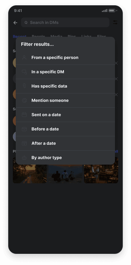
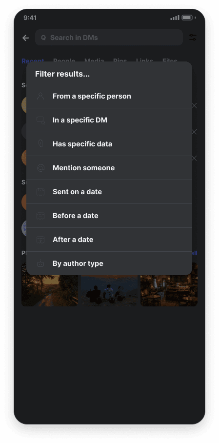
My first pass at this problem invented a search UI from scratch: content-type filter chips, a structured filter form. But comparing it against real screenshots of Discord’s actual search screen showed I’d gotten that wrong: Discord already has tabs for content type (Recent, People, Media, Pins, Links, Files) and a working filter system, just implemented as search-operator syntax (from: in: has:) behind a small sliders icon. The redesign below keeps every one of those existing patterns intact and is surgical about the one thing that’s actually broken: silence where feedback should be.
The Problem, Stated Precisely
After a recent mobile update, Discord’s in-app search became unreliable. Unlike comparable apps, which give users visible feedback about search scope and progress, Discord’s search offers no indication of why results are missing, incomplete, or slow, leaving no way to tell a broken search from a genuinely empty one.
A Decision, Not a Hierarchy
Notifications turned out to be a drill-down tree. Search is a completely different shape: a linear task with a branch depending on whether results come back, plus an optional detour into the filter dropdown that loops back to the same spot instead of going deeper into anything.

Query in, status feedback, then a branch: results or a specific empty-state reason. The filter dropdown loops back rather than advancing.
From Baseline to Polished Mockup
Only two stages here instead of three, since these wireframes started from Discord’s real screens, there was no separate “invented” version I needed to walk back from.
Wireframes, Grounded in the Real App
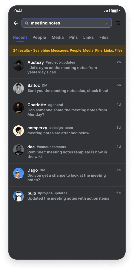
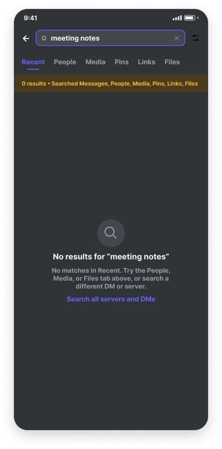
I recreated this straight from actual Discord screenshots, with exactly one addition, highlighted in amber: a status line reporting what was searched and how many results came back.
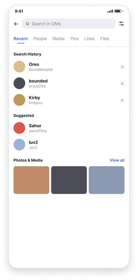
Recent
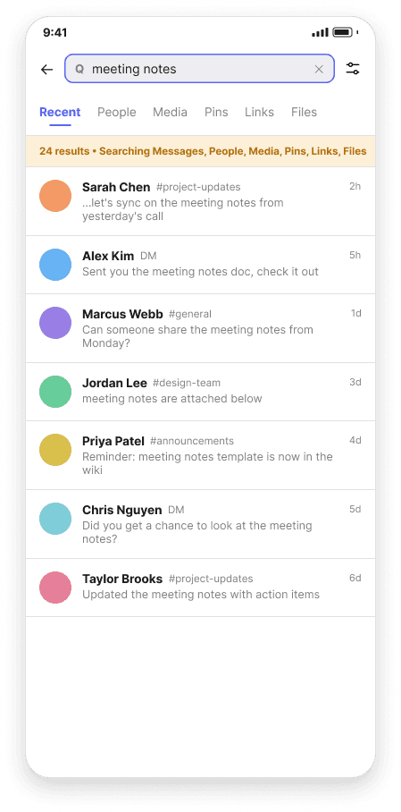
Results

Empty State
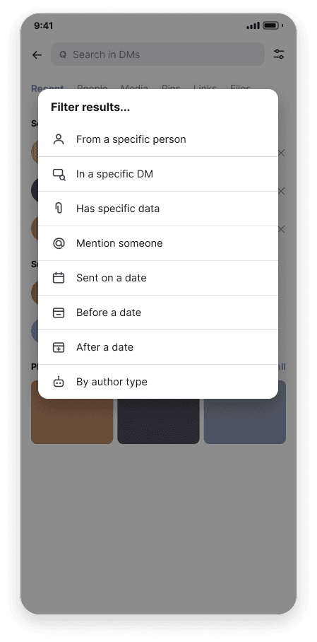
Filter
Polished Mockup
I swapped in personalized avatars and real media thumbnails in place of placeholders, and kept light and dark in exact parity, down to matching photos and per-user name-font styling.
Light mode
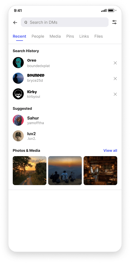
Recent

Results

Empty State

Filter
Dark mode
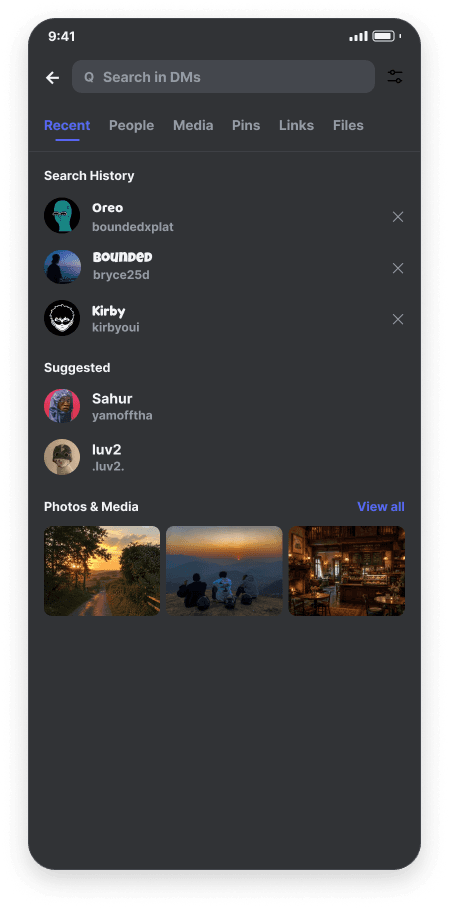
Recent
Results
Empty State
Filter
What This Fixes — and Doesn't
Being honest, this redesign ended up narrower than my first draft. It doesn’t touch content-type browsing or the operator-based filter system, because both already work reasonably well. What it does add:
Visibility of system status: a persistent line reporting what's being searched and how many results came back, so a search that returns nothing looks different from a search that's silently broken.
Recovery from empty states: a specific reason plus a direct action, instead of a dead end.
The bigger lesson here was about my own process: my first version of this section came entirely from competitive research and reasoning, without ever checking it against the real product, and it ended up inventing a solution to a problem Discord had already partly solved. Applying the same discipline I used for notifications from the start, actually checking the real app, caught that mistake before it shipped.
How This Would Be Validated
Everything above is grounded in heuristic evaluation, competitive research, and real screenshots of the current app, but none of it has actually been tested with real users yet. That’s the honest gap here, and it’s the next thing I’d do before either redesign ships.
Method
I’d run a moderated usability test with 5–8 participants, using a think-aloud protocol against the clickable Figma prototypes I built for each flow. A small moderated sample catches most usability problems without needing a huge panel, and think-aloud gets at why someone hesitates, not just where.
Tasks: Notifications
Scoped mute
"You want to stop getting notified about one specific forum, but keep everything else in that server the same. Show me how you'd do that." This tells me whether the Channel → Forum branch is discoverable without any prompting.
Explain an override
"A friend says their notifications for this server look different from yours, even though you're in the same server. Find out why." This tells me whether the overrides summary on the Global screen actually gets noticed and understood.
Tasks: Search
Recover from zero results
Given a search that intentionally returns nothing, ask: "What just happened? What would you try next?" This is the real test: if people still can't tell a broken search from an empty one, my status line and empty-state copy haven't done their job.
Find the filter dropdown
"You want to search only messages from one specific person. Can you narrow your search down to that?" This checks whether the existing sliders icon is discoverable at all, since "hidden features" was a complaint long before I started this redesign.
What Would Count as Success
I’d look at task completion without moderator help, plus a single post-task rating (“I understood why I got these results,” 1–5) for the search empty-state task specifically, since that number, more than completion rate, is what the whole redesign is trying to move. Anything below a 4 average on that question would mean the empty-state copy needs another pass before I can call the reliability problem actually solved.
Part of a broader mobile navigation study across three app interfaces. This case study covers just the notification settings and search reliability sections for Discord.
Next Project