
NETFLIX
UX Research · UI Design
- Category
- UX/UI Design · Product Design
- Year
- 2026
- Role
- Solo UX/UI Designer
- Tools
- Figma, FigJam
Scope
Homepage row browsing & customization
Platform
Desktop web (1728px wide, MacBook Pro 16″)
Deliverables
Research synthesis, wireframes, mockups, prototype
Overview
Netflix’s homepage has always leaned on a simple idea: break a massive catalog into small, curated rows so no single screen feels overwhelming. That structure worked well for years. Then Netflix’s own May 2025 “elevated” redesign came along, enlarging title cards and packing more information onto every tile, and undid a lot of that discipline. Real feedback in the months after launch was blunt: the page felt more cluttered, scrolling took longer, and nothing on the page let people fix it themselves.
I treated that backlash as a design brief. It comes down to three questions, grounded in existing usability research and in what Netflix’s own users were actually saying. How do you reduce visual clutter without shrinking the catalog? How do you shorten the path to something worth watching? And how do you give people real control over their own homepage, the way Apple TV, Google TV, and YouTube TV already do?
The Problem
Three issues compound each other here, and each one is backed by existing usability research, not just a hunch.
Clutter & Information Density
There's a well known idea in UX research called choice overload: give people more visible options, and they tend to decide slower, not better. Netflix's row based system was built partly as a guard against exactly that. The 2025 redesign's bigger cards meant fewer titles fit on screen at once, so the same catalog now takes more scrolling and more effort to parse. Netflix's own year long beta reportedly found no real engagement lift from the change, even though people said in surveys that they preferred it.
Laws of UX, Choice Overload; Nielsen Norman Group
Endless Horizontal Scrolling
Nielsen Norman Group's guidance on horizontal scrolling is blunt: it's harder to scan than vertical scrolling, and it's tougher on anyone with limited motor precision or spatial reasoning. Bidirectional scrolling makes sense for a TV first, remote control interface, but the 2025 redesign made things worse by removing two features that used to help people cut through the row stack, the New & Popular hub and the standalone Categories menu, pushing genre browsing behind search instead.
Nielsen Norman Group, Scrolling and Scrollbars
No Reorder, Pin, or Hide
“User control and freedom” is one of the oldest usability heuristics around, and it's exactly what's missing here. Netflix still has no native way to reorder, pin, or hide a row, and it quietly removed the “Not Interested” button that used to let people suppress recommendations they didn't want (a gap third party browser extensions now exist just to patch). Row and home screen customization is already the norm on Apple TV, Google TV, YouTube TV, and Disney+'s 2026 redesign.
Apple Support; TechRadar, Disney+'s 2026 redesign
The Problem, Stated Precisely
Netflix’s 2025 redesign reduced how much of the catalog fits on screen, which increased how much scrolling is needed to reach anything relevant. With no way to reorder, pin, or hide a row, people have no way to shortcut that scroll or make the homepage their own.
Design Process
The redesign moved through three fidelity stages, each one building on lessons from the last.
Wireframe
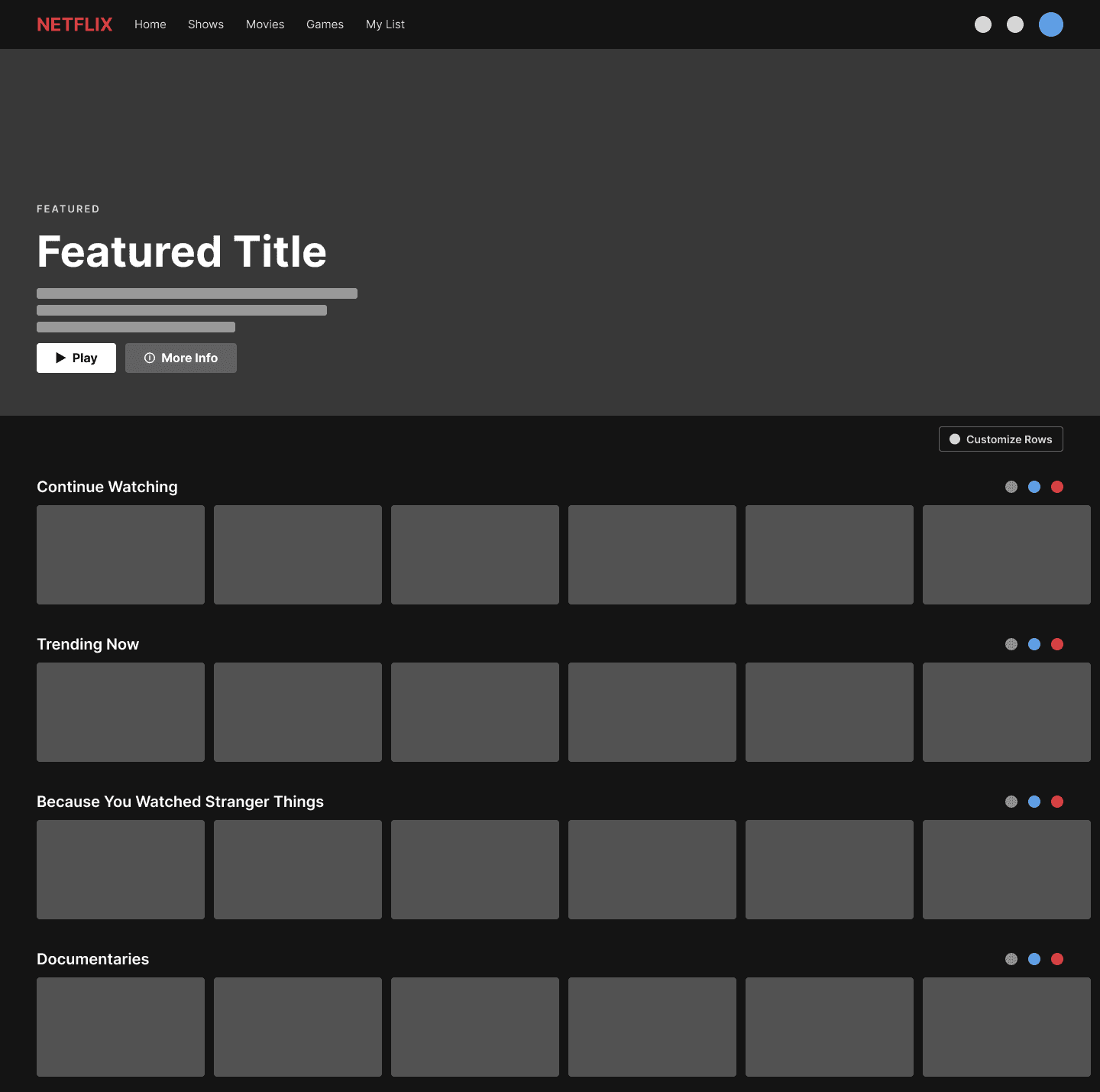
A simple general layout established the core structure: a hero, a row stack, and a colored status dot in each row header marking where reorder, pin, and hide controls would eventually live. This stage was really just about proving the layout could hold the new controls without needing a whole new information architecture.
Low Fidelity
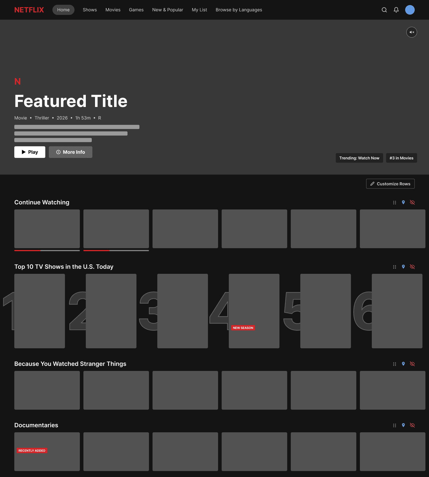
This pass filled in the hero with real content shape, metadata, and a mute control, plus the Customize Rows entry point above the row stack, while every row stayed a plain gray placeholder. It confirmed the layout could carry real content before I spent any time on artwork or color.
Polished
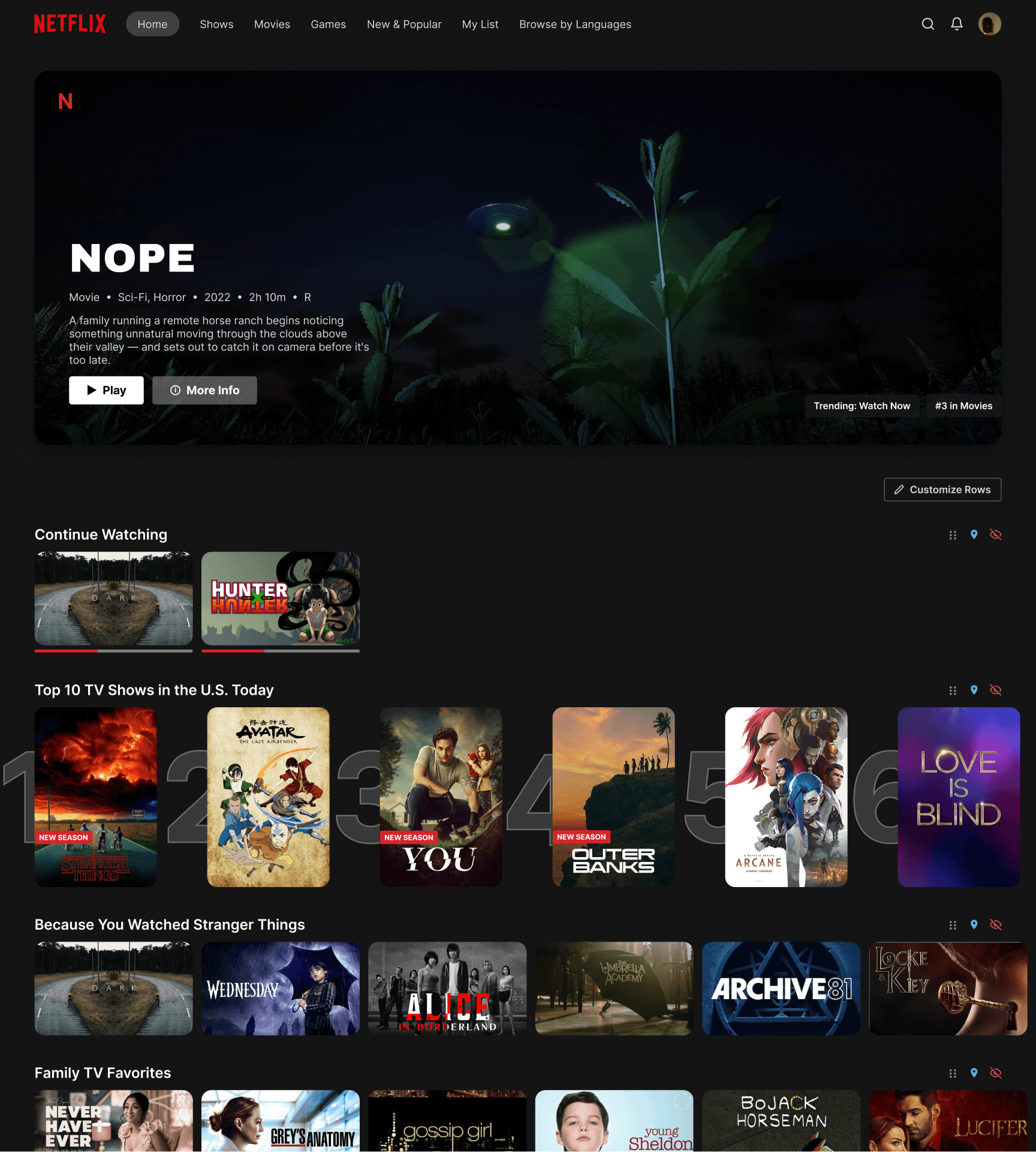
While comparing how other platforms like Apple TV present their homescreens, I noticed calmer, more contained layouts tend to feel less overwhelming than one giant banner. That research pointed me toward my own solution: a smaller inset hero card with rounded corners and real depth instead of a flat banner stretching edge to edge. Every row now uses the same consistent rounded title cards at a 14 pixel radius, and a unified badge system (New Season, Recently Added, Leaving Soon) uses the same wide red band everywhere it shows up. The hero also carries a short, muted video loop, echoing Netflix's own hover preview pattern, sitting behind the title, genre line, and synopsis on a gradient dark enough to stay legible no matter what's playing underneath.
Every screen was designed at 1728 pixels wide, the native logical resolution of a MacBook Pro 16″, so the deliverable reads as a real screen on an actual device rather than an arbitrary canvas size.
The Core Solution: Row Level Control
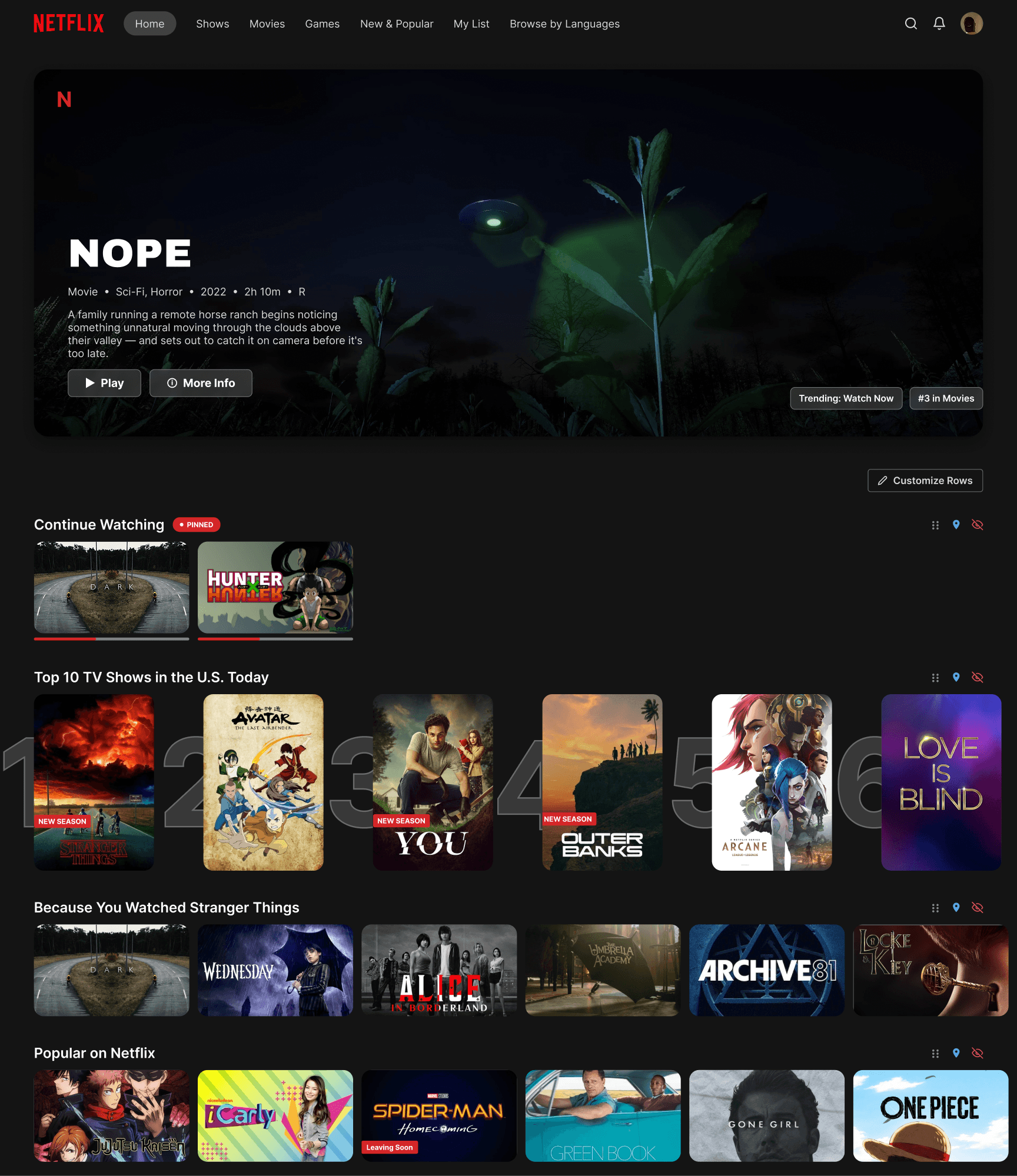
This is the heart of the whole project, the one feature every other decision supports. Every row, not just a special “customizable” subset, carries the same three controls: a drag handle to reorder, a pin toggle to promote a favorite to the top, and a hide toggle to remove it from the homepage entirely. A persistent “Customize Rows” entry point sits above the row stack at all times, so the feature is easy to find without hunting through settings. Reorder, pin, and hide controls live right in the row header itself, not a separate mode you have to switch into, as shown on the Continue Watching row of the polished homepage above.
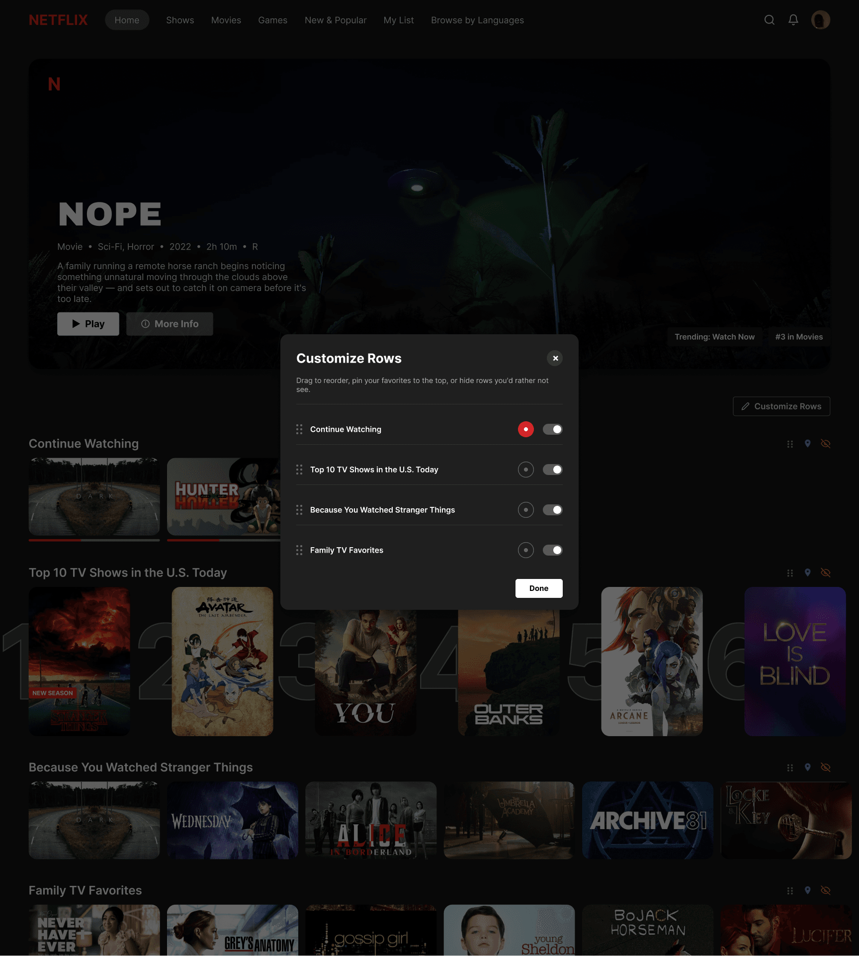
The Customize Rows Panel
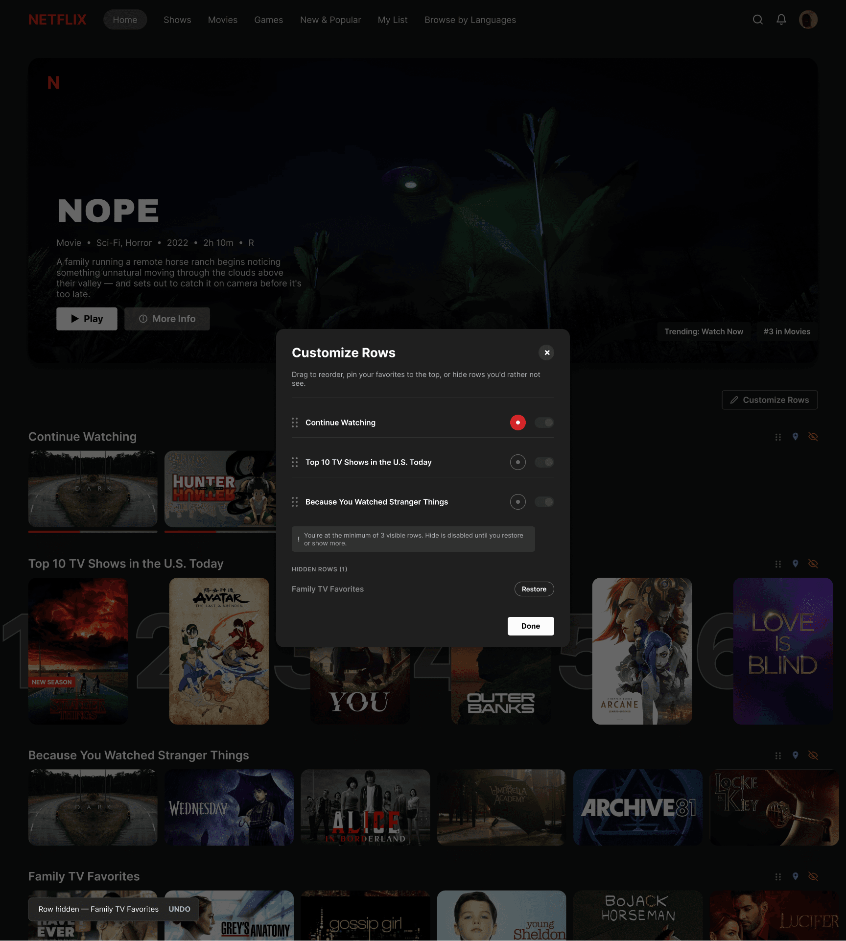
Opening the panel surfaces every row with its controls in one place. Continue Watching shows up pinned, with its badge visible, and the remaining rows can be reordered or hidden right from that same list. The panel also carries the guardrails below it: a note explaining the rule that keeps at least three rows visible, and a Hidden Rows section for anything already tucked away.
Guardrails, Undo, and Recovery
Three safeguards keep this feature from letting someone accidentally empty their own homepage, a failure mode that’s easy to miss when a feature only gets tested on its happy path.
A minimum of three rows
Once someone's down to three visible rows, the remaining hide toggles disable themselves with an inline explanation, instead of silently failing or letting the page go empty.
An undo toast
Hiding a row surfaces an immediate, dismissible confirmation with a one tap Undo, so the action never reads as silently permanent.
A Hidden Rows list
Once the toast disappears, the hidden row doesn't vanish without a trace. It moves into its own labeled section inside the same panel, with a Restore button, so undoing an earlier decision never takes guesswork.
Restoring a row from the Hidden Rows list lands on the same result as hitting Undo before the toast disappears.
Proving the Loop: Before and After
To show that the feature actually does something, rather than just presenting controls that look functional, the redesign includes a resolved “after” state. Continue Watching carries a visible Pinned badge, the row someone hid is fully gone from the stack, and a new row, “Popular on Netflix,” backfills the space instead of leaving a shortened, mostly empty page. That backfill detail matters: hiding a row should make the homepage feel more relevant, not just smaller.
A Second Escape Hatch: Browse by Genre
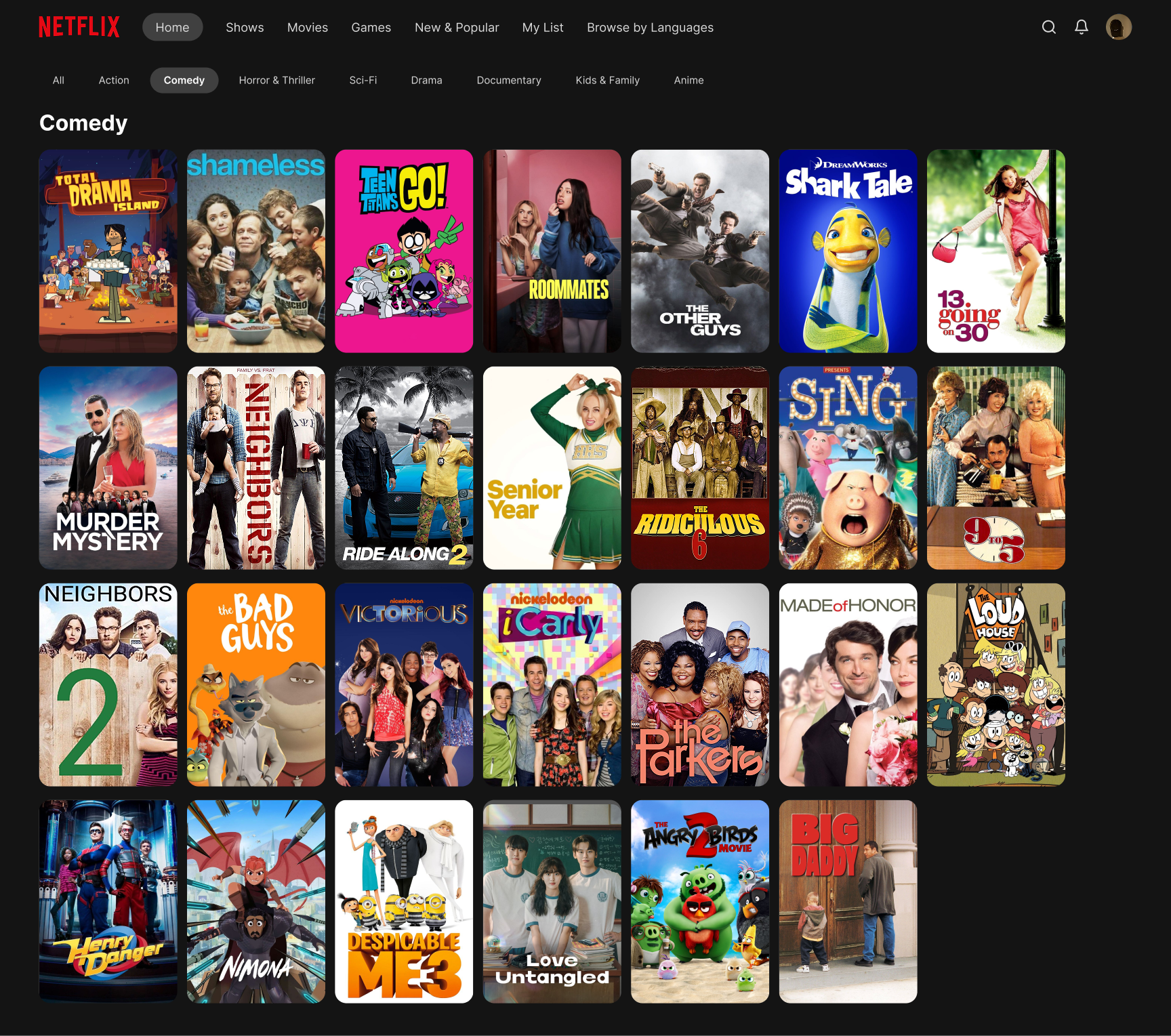
My research synthesis specifically called for a real way to browse everything, or a grid view, as part of the fix for endless scrolling, and restoring New & Popular in the navigation only solves part of that. A dedicated genre browsing screen gives people a second way out of the row stack entirely: a horizontal row of genre pills paired with a true wrapping grid, structurally distinct from every other screen in the product, so scrolling through rows becomes a choice instead of the only path to a decision.
Prototype
The full flow is wired as an interactive Figma prototype, not just a set of static comps. From the homepage, Customize Rows opens the panel with a Smart Animate transition. Hitting Done resolves everything into the state you’d see afterward, and that same screen’s own Customize Rows control reopens the panel, closing the loop. A second branch covers the safety net path end to end: hiding a row triggers the undo toast, which either reverses the action or settles into the Hidden Rows list after a timeout, and Restore from that list arrives at the same restored state Undo does. Both recovery paths actually connect to each other, they aren’t just illustrated once and left dangling.
A real walkthrough of the prototype: opening Customize Rows, restoring a hidden row, then jumping into Browse by Genre.
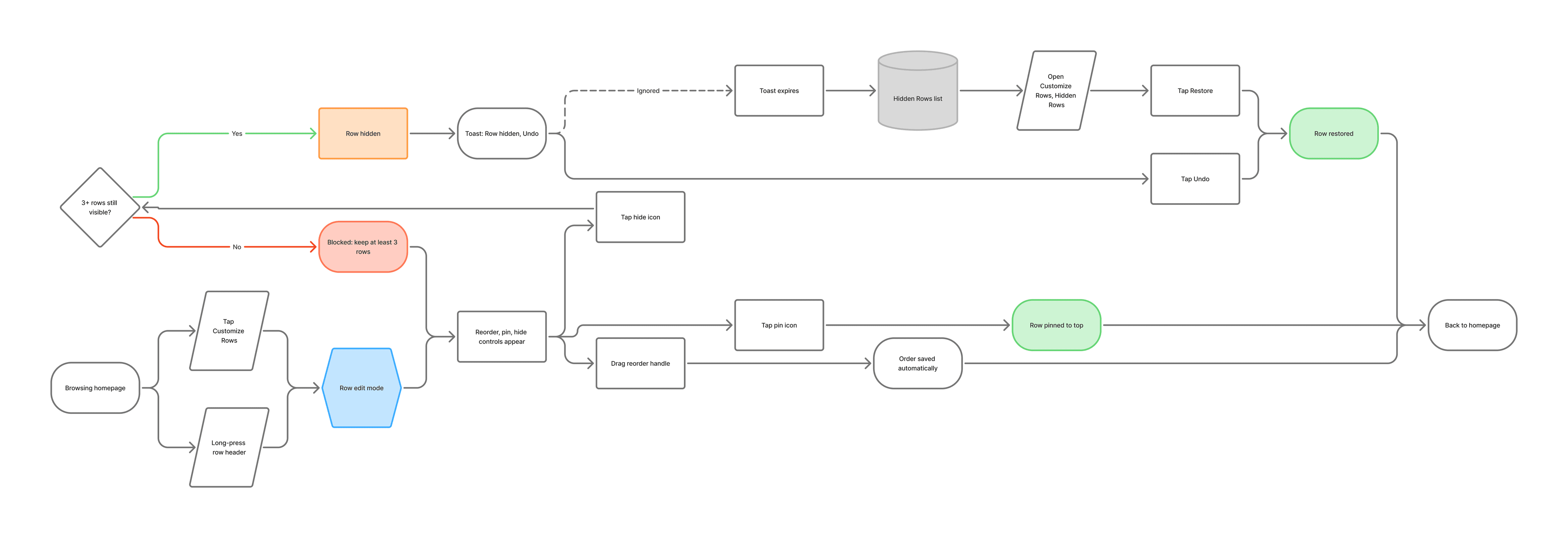
Mapped in FigJam before any screen was built: three branches off row edit mode, and both recovery paths (Undo, Restore) converging on the same result.
Reflection
The three problems in my research doc ended up compounding each other in a single causal chain. Bigger cards reduced how much fit on screen, which increased how much scrolling was needed to reach anything relevant, and with no way to prune or reorder rows, people had no way to shortcut that scroll. Framed that way, this wasn’t three unrelated features to design. It was one coherent fix: reduce how much someone has to look at once, shorten the path to relevant content, and hand people control at the row level to make their own homepage smaller and more relevant over time.
Recognition over recall: a persistent “Customize Rows” entry point sits above the row stack at all times, instead of being a feature buried in settings that people have to already know exists.
User control and freedom: every row, not just a special “customizable” subset, carries the same reorder, pin, and hide controls, closing the exact gap third party extensions exist to patch.
Error prevention over error messages: the rule that keeps at least three rows visible disables the hide toggle before someone can empty their own homepage, rather than warning them after the fact.
Visibility of system status: the undo toast and Hidden Rows list mean a hide action is never silently permanent, and recovering from it never takes guesswork.
Given more time, the next thing worth exploring is a mobile version of the same system. Row control and undo patterns behave differently under touch than under a mouse, and Netflix’s own real usage skews heavily mobile, so building and testing a touch based pass would really put these interactions, dragging to reorder especially, to the test outside a desktop pointer model.
Sources & Research
- Laws of UX, Choice Overload
- Nielsen Norman Group, “More Choices, More Trouble”
- Nielsen Norman Group, Scrolling and Scrollbars
- CreateBytes, Netflix Design: A Deep Dive into UX Strategy
- Netflix Tudum, How to Use Netflix's New Homepage's Features
- TechRadar, coverage of the 2025 Netflix UI redesign backlash
- Yahoo/AP, coverage of Netflix's engagement research on the redesign
- UX Planet, Understanding Bidirectional Scrolling in Streaming Apps for TV
- TheStreamable, user reactions to Netflix's new interface
- What's on Netflix, reporting on removed New & Popular and Categories features
- Trim (gettrim.cc), on the removed “Not Interested” button
- UNILAD Tech, on Netflix's hidden genre browsing
- Apple Support, customizing the Apple TV home screen
- TechRadar, Disney+'s 2026 personalization focused redesign
Next Project